Transforming the EQS Design System
EQS Group


Shortly after joining EQS, I learned that Marketing had just completed a company rebrand – which meant our team now needed to incorporate the new brand into the client-facing product. Unfortunately, the existing design system was not suited to the changes that we needed to make, and the development implementation of the old system was messy and heavily customized. Based on this, we decided to create a design system completely from scratch to meet our goals.
Myself, one other designer, and two front-end engineers worked together to design this new system in just over two months, and develop it in just over two weeks. Then, eight more front-end engineers joined us for a final two-week sprint to implement the new system into all six product areas.

The previous design system had overly complex components that did not follow logical variant patterns; sizing and color selections were consistently WCAG inaccessible; each product area had its own branding; the overall visual design was quite dated; implementation of variables was basic at best.
The first task I took on as part of this project – and, in fact, my first task at EQS – was to create a new design system. The existing system did not align with the new direction and was incredibly difficult to use. I started with the base level elements: redefining the grid, color hex values, spacing, and type styles as Figma variables. All components were created using these variables, which in turn created an incredibly powerful, lightweight, and flexible system.
We decided to go for a highly efficient, theme-level variable approach instead of the more complex component-level approach, which could end up with four+ levels of variable connections. (We may opt for the component-level variable approach as our products and design system continue to mature, but for now the two-level approach is the better fit.)

There were numerous stakeholder touch-points during this project, including design reviews, product reviews, and workshops. I facilitated workshops to inform some of the bigger decisions, like which fonts to use and which global patterns to address, and the teams came together for weekly syncs to help us collect and incorporate feedback quickly. Some of these processes are now built into our design team Ways of Working.
There were a lot of eyes watching our progress once this project entered development, which meant I needed to be calm and pragmatic while supporting the team through tense situations and a very tight deadline. Fast decision-making and consistent documentation allowed us to reach agreements quickly and understand which items should be prioritized and which could be deferred to a later time.
Throughout this whole project, I needed to negotiate compromises and acquire buy-in from multiple stakeholders and teammates in order to improve the overall system and move the project forward. My goal was stay as closely aligned with development as possible.
Our new design system and implementation was completed from scratch within three months. The company goals for the project were simply to update the look and feel – without disrupting workflows. But the goals of our small team were significantly more than that: to rewrite much of the frontend codebase in order to create a clean slate and stable foundation, and to update the look at feel without disrupting workflows (too much). Meeting this parallel goal meant we were able to to launch a clean and efficient design system and component library, up-leveling the quality of design and code in just a few weeks.
Accomplishing all of this in such a short amount of time required us to make calculated decisions around which items we would design uniquely and which we would pull from an existing library. For example, we selected a well-known and trustworthy font, and purchased icons from libraries instead of investing time we didn't have to create wholly custom pieces. (This would be an interesting area of investment in the future to make the product even more unique. I know from experience how custom icons can add to a product, but also how much time and effort they require!)
Finally, with our new design system implementation, we were able to implement Dark Mode in the product with minimal additional development effort, creating a very cool "nice to have" feature for our users.


Side by side comparison of the before (left) and after (right) Compliance Cockpit dashboard view. Now that the redesign is completed, we can start looking into optimizing the experience of this page.

Side by side comparison of the before (left) and after (right) policies list view.

Leaning into variables allowed us to significantly reduce size and complexity of components, as well as more closely align with development.

The complete EQS Brezel color palette – Though it looks like dozens of colors to manage, we heavily used Scoping to narrow down the color options for designers so that the use cases were clear.
Launching our new design system was a major accomplishment for EQS. From a technical standpoint, we reduced the size of the style sheet package by over 90% and that number will be reduced by half again once we finish a few other key, fast-follow-up items. We also eliminated tens of thousands of lines of code after adopting the new component library into each product area. These changes resulted in significant improvements in website performance, as well as increased development efficiency when building new features (as previously, much of each product area was built with custom code and "snowflake" component implementations).
From a design standpoint, we reduced the number of components by 75%, significantly simplifying the complexity, size, and maintenance effort of the library, while also enabling the design team to work more efficiently and consistently. We also managed to decrease the amount of component library files from five to two.
Lastly, not only did we create a completely new design system and implement it across all products, but we also created another new app in the process: The developers now have an internal documentation site that is completely built with all of the new components.
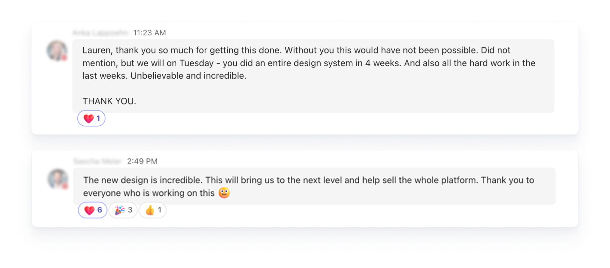
This major product update demonstrated that amazing feats can be accomplished when design and development are fully collaborating and working well together. The redesign effort was well received by the company, noticeably increasing the sellability of the Compliance Cockpit. We look forward to seeing the quantitative impact later this year!


